With the popularity of microbreweries around the Minneapolis metro area its quite a task to put together a brand that stands out among the crowd. Surly Brewing Co has been doing just that since their inception in 2005. Being one of the more well-known breweries in Minneapolis, its marketing success can be attributed to a variety of factors. Near the top of that list is how recognizable the logo is.
![]()
The logo itself uses bold colors that stand out and give the whole mark high contrast. This creates a “loud” character to that falls in line with the edgy/punk image the brewery is trying to present. This is a common approach with microbreweries that are a part of a market dominated by large companies like Anheuser Busch. Even with the saturation of this approach they manage to stand out well with their logo. The sharp angles and jagged edges of their font are also in-line with this aesthetic. The imagery of the person unhappy with an empty beer glass and happy with a full beer glass is playful addition that can be flipped to work upside down. The shape that surrounds that illustration is also in the shape of a traditional wooden cask. The wordmark can also be separated from the illustration and still holds plenty of the logos character to carry on its own.
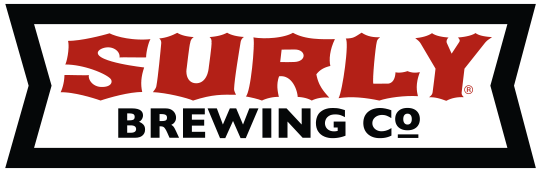
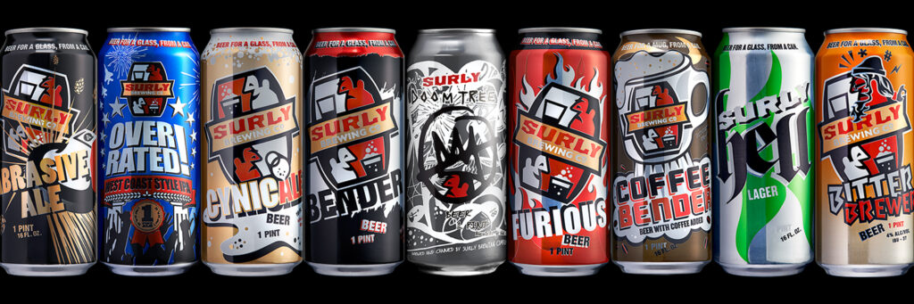
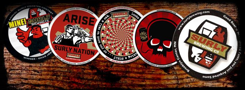
This versatility is the real strength of Surly Brewing’s logo. It has been used on just about every piece of merch imaginable. The employment of some talented artists and the company’s heavy involvement in their surrounding community has given them a variety of opportunity to put their logo on display. The strength of its design has contributed greatly to the brand’s ubiquity. Strong branding and design help create customer affinity and loyalty.