There I said it.
Personal bias aside, the Minnesota United Football Club logo has some incredible strengths that help it stand out, and not just among other sports team logos. With the opening of their new stadium on the horizon, now seems like a good time to gush a little more about this logo.
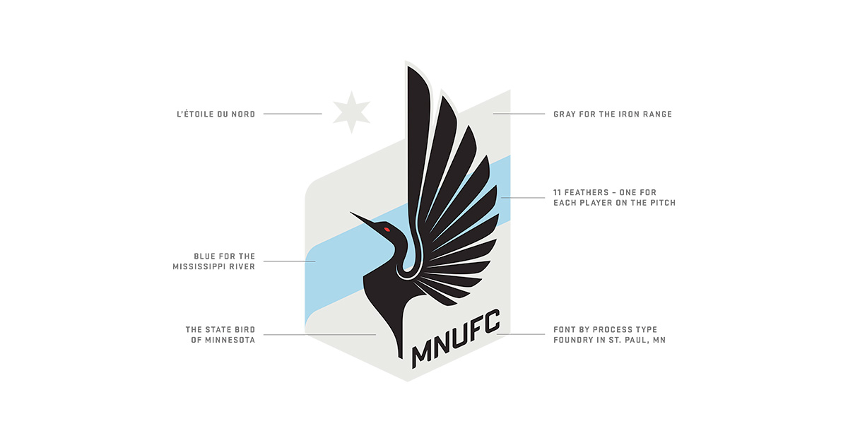
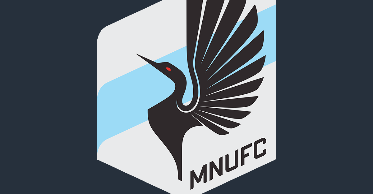
Each piece of the logo represents something that ties back to Minnesota including a custom font that was created by a company in MN. The high contrast between the black, gray, and baby blue provides a color palette that is unique among sports clubs, but is also very dynamic. The blue stripe is often used with a transparent overlay that really helps drive home its symbolism as a river.
While these points help make it a strong logo, the aspect that makes it so dynamic is its asymmetrical emblem shape. The tension created by keeping most of the detail on the right side of the logo draws you in and the shape of the wing guides you through the rest. While the North Star (we Minnesotans really love that thing -adding link to my Star Tribune post here-) helps to balance both sides of the logo it also helps to emphasize the shape of the emblem. This asymmetrical shape allows the logo to be used in interesting ways where a traditional more symmetrical logo would look out of place.
If you missed it, a recent post of ours laid out a few of the very techniques used to make this such a great logo.