It is slowly becoming common for the most well-known brands to remove their name from their logo, sometimes allowing it to leave completely on its own. Proving that their marks are so ubiquitous that anyone who sees them can remember the name. Target is our own homegrown version of this branding success.
The strengths of the mark are simple and easy for all to see. So instead of harping on about how good a job they’ve done with the most recent iteration of the logo, I thought I’d examine some of the older versions.
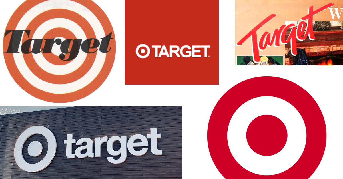
The original logo was released in 1962. In some ways the majority of the work that has led to their success was built on this now 57-year-old logo. Even though it has a few more rings than its final form and the overlayed text probably eventually presented problems rendering in single color this logo definitely has a unique charm to it. The font was a heavy serif common among retailers at the time, though it stands out among the popular sans-serif fonts of today.
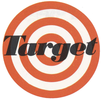
In 1975 they updated their look with sans-serif and further distilled the target mark. The simplified target emblem and highly legible font help to really cement the brand into its current position.
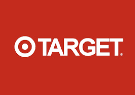
In 1989, they got a bit swept up in the prevailing style of the 80s and briefly introduced a brush textured wordmark. Not particularly unique, this logo can probably be credited for at least one thing: illustrating just how strong their logo was before the shift.
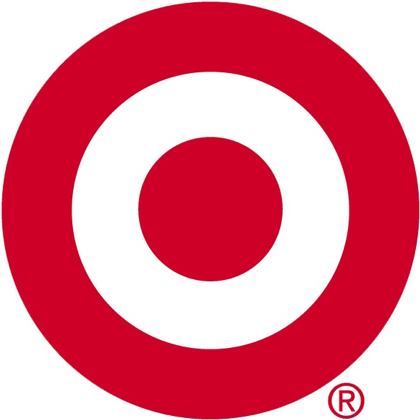
So, in 2006, they returned to the mark that helped make them a household name back in 1969. The name no longer needed, they have been rocking the red and white with curves determined by pi ever since.
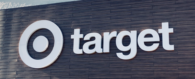
Only last year they began rolling out versions with the wordmark back, but in lowercase. Presumably there are still SOME of cases where additional identification is necessary. The strength of the brand is undeniable. With some hindsight, you can see that building a brand with a strong logo mark will stand the test of time.