
I am a typography snob. I judge the reliability and competence of companies almost solely based on what (and how many) fonts they use in their advertising. I don’t use coupons very often because I get distracted when the layout artist forgets to kern the 1. I avoid certain routes on the way to work in order to avoid billboards that have bad typography. They repainted the water tower I can see from my office window and did a horrible job of combining two typefaces into one word, plus the kerning is all over the place, so I closed my blinds and haven’t opened them since.
I understand that I am an extreme case, twisted and made cynical by years of graphic design work, but, though extreme, I am not alone in my hatred of bad typography, and certainly not alone in my love of good typography. Just search ‘typography’ on Pinterest or Instagram once, you’ll lose days of your life to a celebration of the most carefully crafted type. And that brings me to my point, the world as a whole has woken up both to the beauty and the importance of typography. Your messages are more and more often being judged not only on the words you use, but also what those words look like.
As a designer/marketer I often have the privilege of helping a company either develop a new brand look and one of the most important aspects of that look is always typography. One of the most interesting points in any brand concept presentation is when I get to the point where I tell the client the name of the suggested font. Fonts have strange names and some are stranger than others. Lately it seems that more type designers are including the typographic classification into font names, leading me into conversations like, “This font is called Brandon Grotesque,” I said. “Grotesque?” they interjected, “But it looks very nice, why would they call it grotesque?”.
Most people never have to deal with type classification, they simply know the name of their corporate font and the basic fonts that came loaded on their computer. Almost everyone now knows the difference between sans serif and serif fonts. We type snobs however, know that there are at least four classifications of sans serif and six for serif styles.
Here’s a little peek into type classifications, so you can sound really smart in your Instagram comments.
The most famous font in the world, Helvetica, is a Grotesque Sans Serif, just like my new friend Brandon.
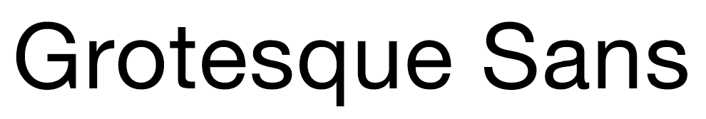
In fact, many of our clients use primary typography that can be classified as grotesque. These styles were the first sans serifs and have retained their popularity.
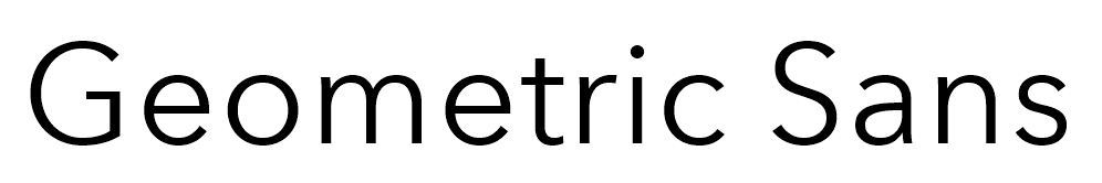
The next most commonly used classification among d.trio clients has to be the more even and, well, geometric, Geometric Sans styles. These styles are also quite popular but somewhat less readable at smaller sizes. Avenir Next is a good example of a geometric sans.
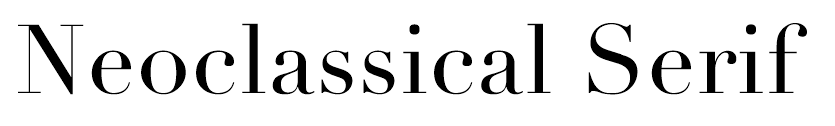
It does seem to be a sans serif world right now as sans serif fonts tend to be easier to work with and hold up better used large or in solely digital forms like web typography. But here’s a quick reminder of just how beautiful a serif can be.
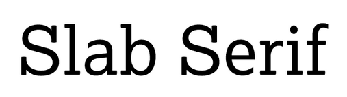
There are a lot of good modern serif styles out there and some of the most popular currently can be classified as Slab Serifs. Slab serifs feature large, blocky serifs and are often said to be a sans in all ways except the serifs.
If you’re still with me at this point, you too might be a typography snob (or at least a budding one), and you may find this page about type classifications interesting. Good luck finding great type in the world, and also good luck unseeing the bad.